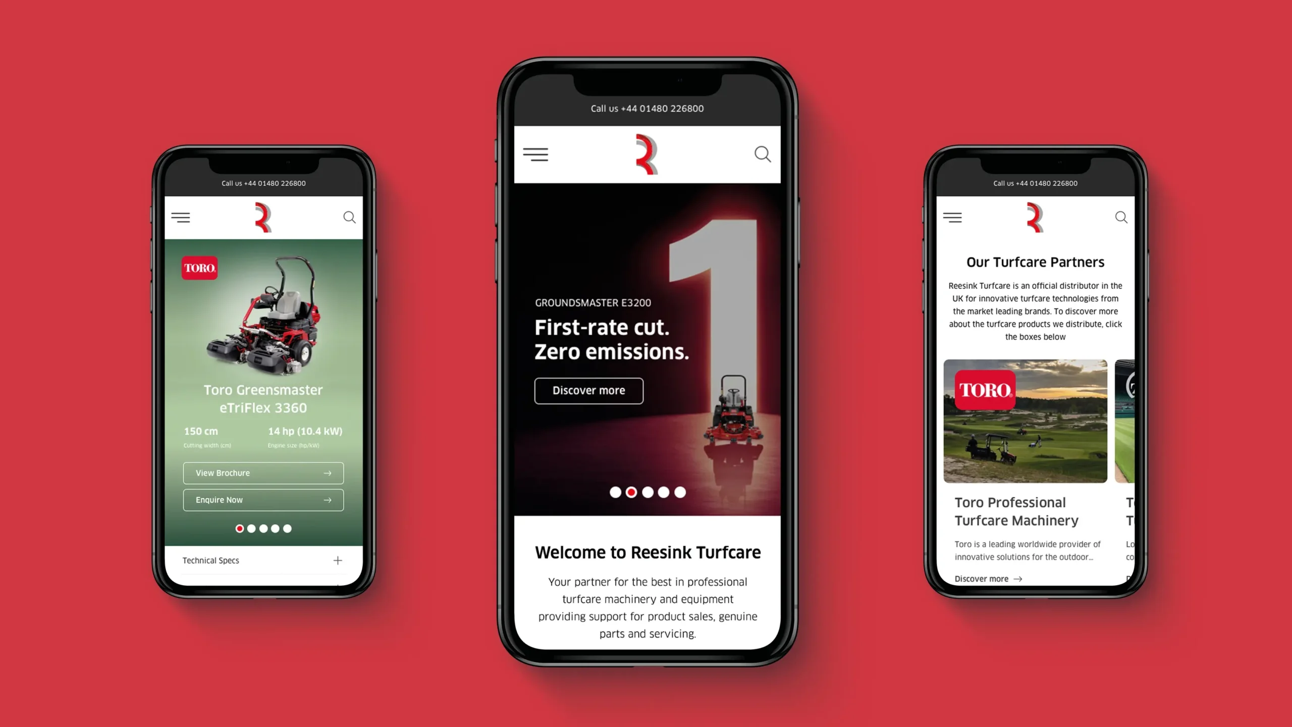
Website trends are constantly evolving, which means Reesink is too
In recent years, website trends have continued to shift toward more user-centric experiences. And there is some science behind it, too. While the trends themselves may evolve or change regarding how to present content and information, the goal of user-centred design remains the same: to put the user first. Which is exactly what Reesink Turfcare has done in the design and launch of its new website.

Reesink Turfcare’s new website is now live.
As Gillian Haverson, Marketing and Communications Manager at Reesink Turfcare, says: “As technology develops, the way a website works changes dramatically and it’s important we move with that flow, to ensure our customers’ experience of interacting with us on a screen, is as intuitive, smooth and pleasant as possible.”
The objectives were quite clear. The new site shouldn’t just be for Reesink’s users but about them. The way the site works shouldn’t get in the customer’s way as they journey through, it should be a good experience, with the customer coming away better off – having acquired relevant information about a product, trend, technology, fellow club, initiatives or events.
Handcrafted by UX/UI designers using years of collated data insights from turfcare professionals on how they find and view information, Reesink knew it was a priority for their customers to have a more intuitive, friendly website, that’s faster, sleeker, and logically ordered and easier to use, pleasing to look at, with additional information such as infographics and videos.
As well as enhancing flow and movement around the site, the new website inspired a refreshed content strategy to optimise the experience. There’s more information about all the products in the Toro, AgriMetal and Nordic Plow ranges Reesink distributes. All articles are now optimised to ensure customers can find them more easily and tackle all the subjects Reesink knows affect turfcare professionals by Reesink’s experienced turfcare team.
This double-pronged approach of an optimised website that is easier to use with refreshed and improved content works to create a website full of value, that serves a purpose. This is no showboat of a website; it is designed with purpose for the greater good of all the turf and grounds professionals who need quick access to machinery and equipment information and useful guides on best practices or to view independent product tests.